Why YSK: Because that’s friggin awesome?!
Screenshots (themes also have dark versions):
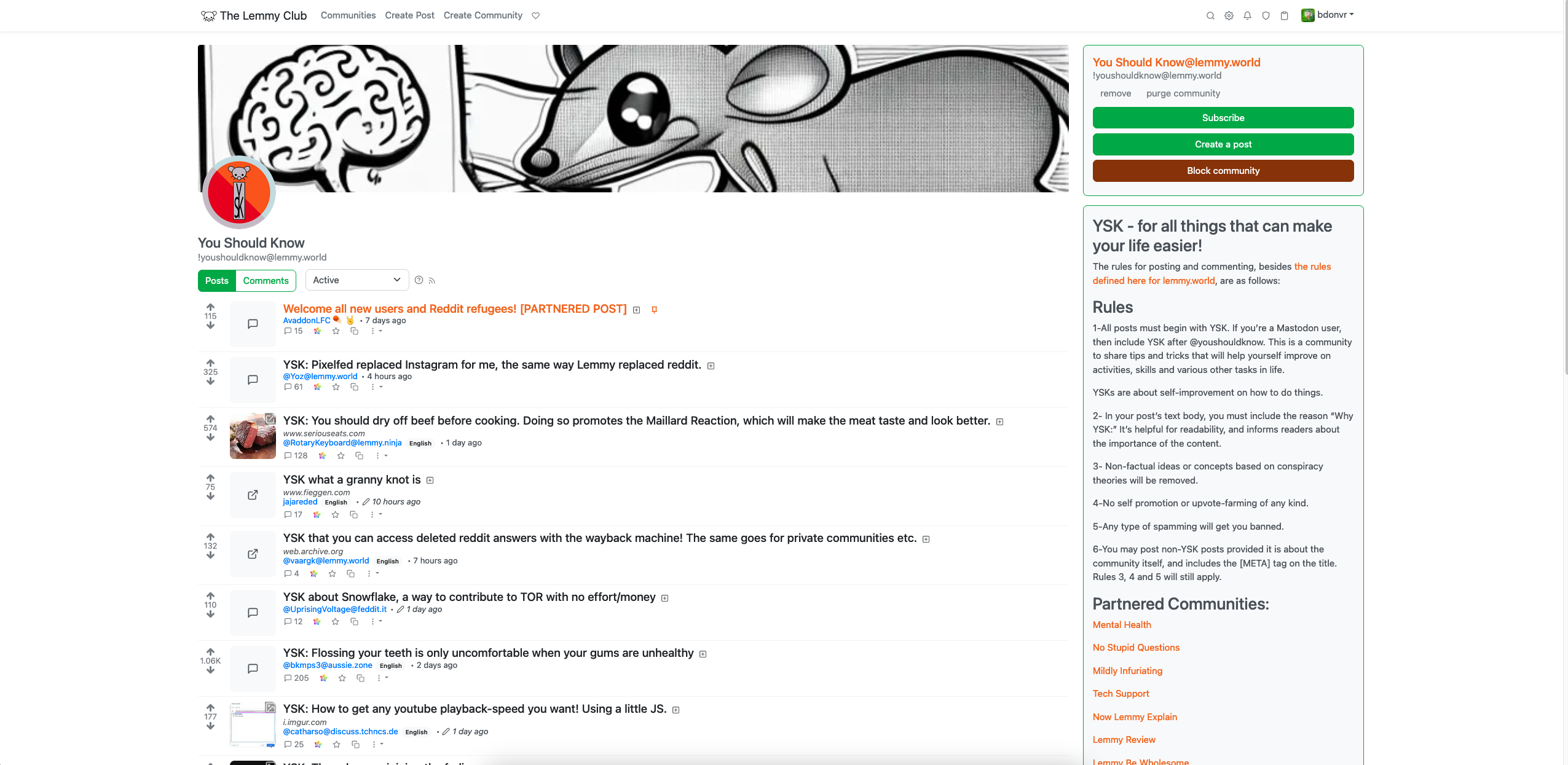
Default: 
Default-compact: 
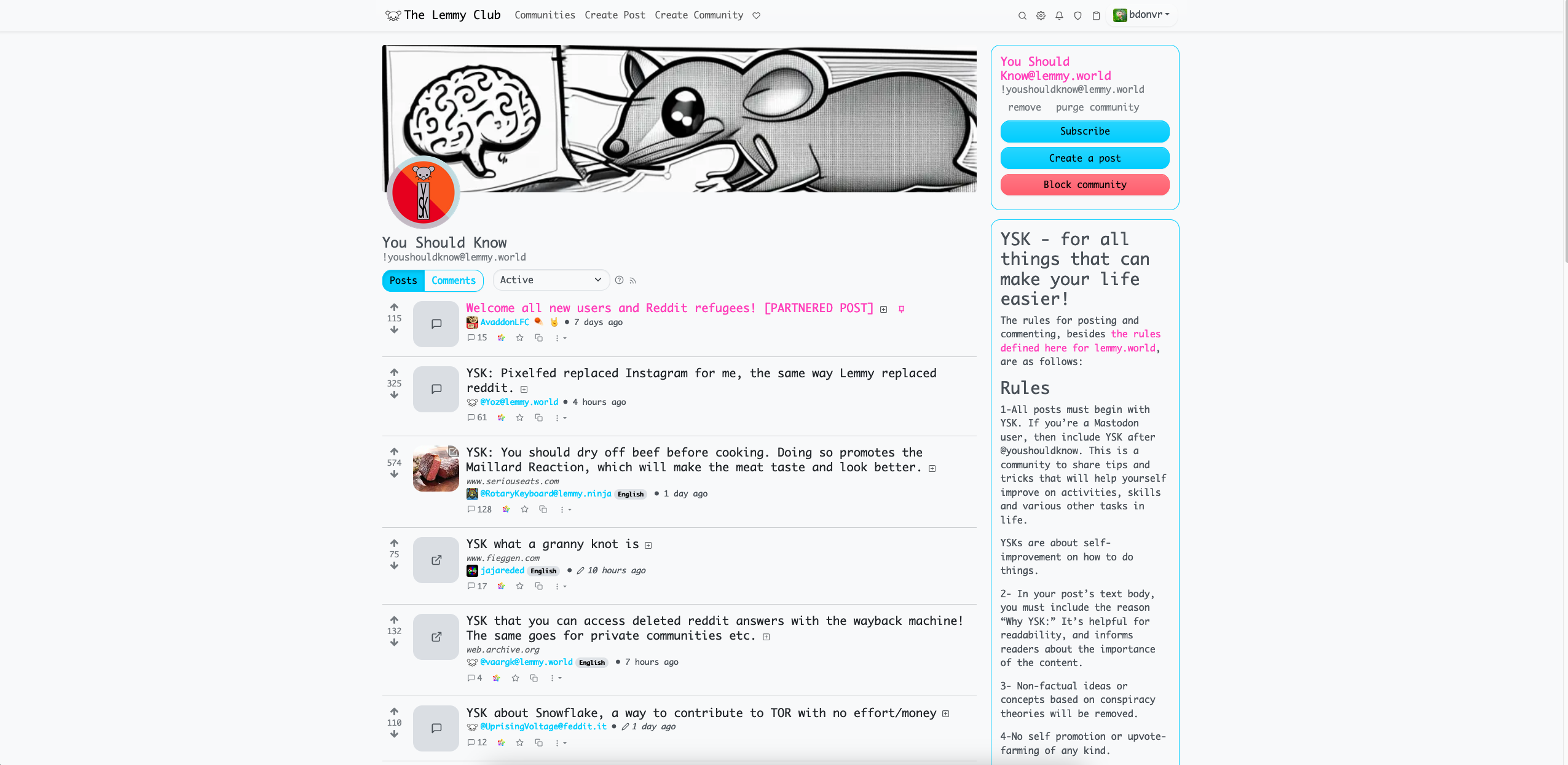
“Vaporwave”: 
There’s also an odd “i386” theme, along with a “pure black” darkly.
Why YSK: Because that’s friggin awesome?!
Screenshots (themes also have dark versions):
Default: 
Default-compact: 
“Vaporwave”: 
There’s also an odd “i386” theme, along with a “pure black” darkly.
I do like the compact views. The spanning across the entire width of the screen doesn’t feel entirely right layout-wise, imo, but my home feed being able to show me more info at a glance is nice.